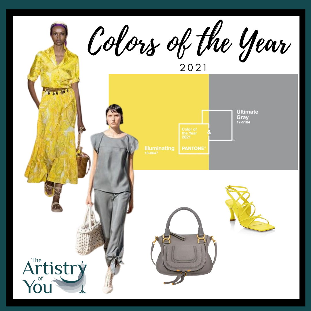
Each year my clients ask, “How does Pantone pick the color of the year?” and “How do I wear Pantone’s color of the year?”. Let’s look. The Pantone 2021 color of the year is actually two colors: Illuminating, a bright and warm yellow, and Ultimate Gray, a practical, medium-light gray. Why two colors instead of one? The Pantone color experts really don’t really give an answer, but let’s face it…2020 wasn’t normal, so why would Pantone’s 2021 color of the year be?
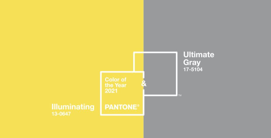
How does Pantone pick the color of the year?
Every year Pantone selects a color of the year after combing the world for color influences in film, the art and design communities, travel, lifestyles, and socio-economic conditions. Considering this, a selection of two colors makes sense. Pantone describes the color combination as “A marriage of color conveying strength and hopefulness that is both enduring and uplifting.” The colors are described as a combination of elements that come together to support one another. Ultimate Gray being practical and rock-solid, while Illuminating expresses thoughtfulness with the promise of something sunny and friendly. They are spot on with these colors as we need stability as well as optimism as we look to the future.

Why it’s important to know the colors of the year:
You may be asking, “Why is it important for me to know the colors of the year as a professional, a business owner, or a woman trying to stay in touch with her style?” As an image consultant and stylist, I offer two reasons:
- Knowing the color and style trends will keep you up-to-date and current.
- Knowing the colors of the year and season will help you to find garments and accessories that look fabulous on you when they’re available in stores or online. In other words, you will be able to find these colors more readily in clothing, accessories, and home décor during that particular year as manufacturers create more selections in the “on-trend” colors. If they are fabulous colors for you then it is a great time to buy some investment pieces for your wardrobe.
How Do I Wear Pantone’s 2021 Colors of the Year?
The key to knowing how to wear the Pantone color of the year and any trend colors is knowing if they flatter you. The best way to discover this is a professional color analysis. During your color analysis, we discover how certain colors flatter your skin tone, hair, and eye color. We also rule out colors that make you look dull, sickly, jaundice, or – shudder –older. This is most important with clothing, jewelry, hair color, and makeup colors.
Using this information, we create your personalized color fan and color guide. We include your best or signature colors. And we include your accent colors — those that when combined with your best colors, create your best contrast for a “wow you look amazing” image. These tools are essential for shopping success for everything from clothing to makeup to eyewear. Knowing your best colors is the key to looking your best, building your wardrobe wisely, maximizing your choices, and knowing how to be a savvy shopper.
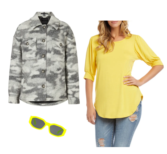
For example, if Illuminating is one of your best colors (it would be in the “great/signature” section of your personalized color fan), then wear it anywhere on your body especially close to your face. You can buy any garments or accessories with confidence if the color is one of the best colors in your personalized color fan.
See photo examples below:
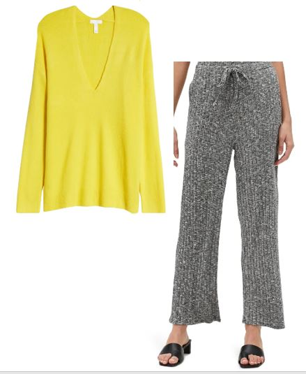
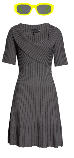
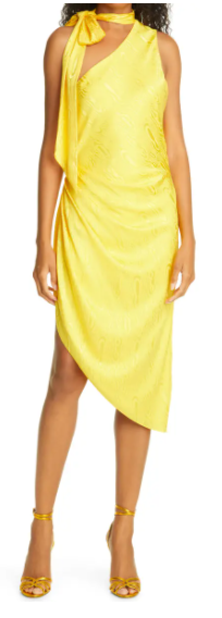
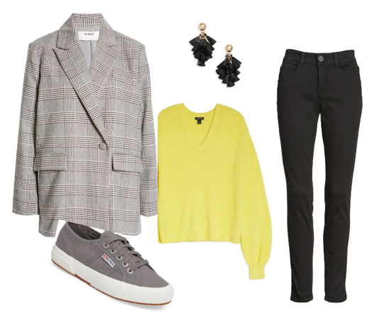
If Illuminating Yellow is in the “accent” section of your color fan, this means that you can wear the color in a pattern or on the bottom half of your body such as in a pant or shoe color, but not by itself close to your face (like a solid top or dress).
Think the 80/20 rule. Wear your best colors as much as possible. They should comprise 80 percent of your wardrobe. Meanwhile, your accent colors can be 20 percent of your wardrobe. Accent colors can be in a pattern where the accent color is 20 percent of the pattern and the rest of the pattern colors are your best or “signature” colors. See examples below.
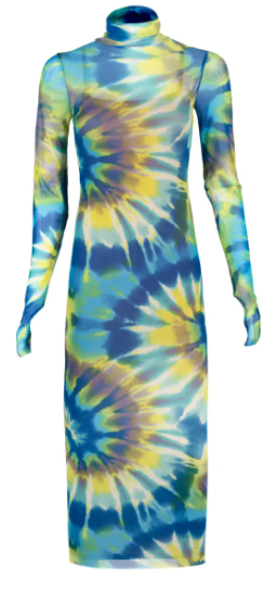
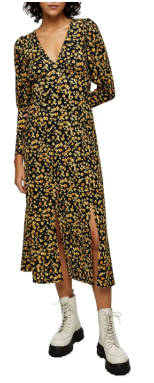
If you haven’t had a professional color analysis, I urge you to do so. It will change the way you shop and will empower you to look your professional best. It is essential in fact, for looking your best and creating a wardrobe that enhances your image. You can schedule an in-person color analysis here, or begin the process for a virtual color analysis here.
Here are some guidelines to help you. Illuminating is a very vibrant yellow so it is best for those who have either a cool and bright coloring or a warm and bright coloring. If you have a more muted or soft look, it will be best if you wear illuminating yellow as an accent accessory, or in a pattern such as a striped shirt with a soft white or ivory paired with it, or in a soft floral pattern for example. See the idea below.
Find all of the pictured styles in my “How to Wear the Pantone 2021 Color of the Year” catalog. Just click here to see them all!
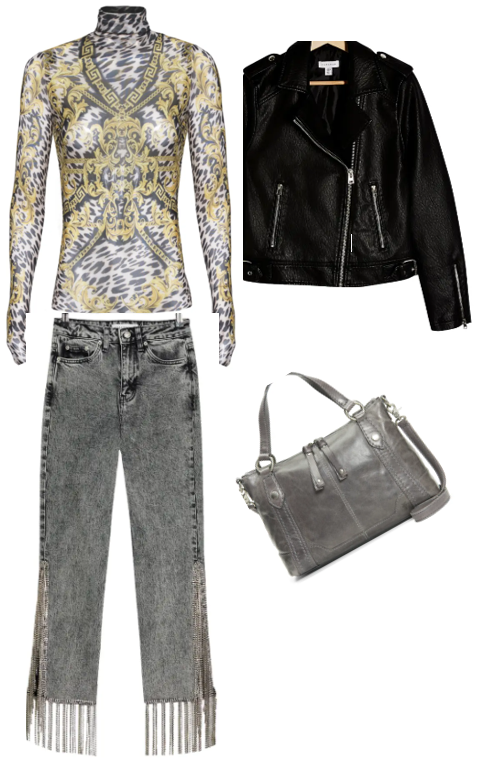
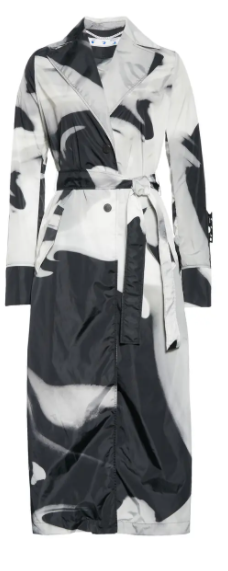
To wear Ultimate Gray is a little bit easier. This light gray shade is actually non-chromatic, and it considered neutral, which means anyone can wear it. However, it is not everyone’s best color. In fact, it will look just “ok” on most people. So, the best way to wear Ultimate Gray is with one of your best colors closest to your face. Think of cardigans, jackets, trench’s in Ultimate Gray … garments with which you can add a scarf or wear a great color underneath. Or as the photo below shows, you can wear a print that has gray and another color such as bright white if bright white looks fabulous on you. This will ensure your best look while having a core garment that will match many colors in your wardrobe.
Stay tuned for more tips on how to wear the Pantone Spring 2021 colors in my next blog post. Sign up for my monthly newsletter so you will not miss any of Pat’s fabulous style tips: Newsletter Sign Up
To discover your signature and accent colors and so much more schedule an in-person Color Session now. Are you out of town??? No worries! Pat performs her virtual color analysis with the same process as in-person but with virtual drapes. It may be virtual, but it is still very personal. Click here to get started.
 Pat Gibson is a certified Image Consultant, Personal Stylist, and owner of The Artistry of You, LLC. To learn more about how Pat can help you achieve your best personal style and image call 440-212-2269 or email , or click here to schedule a complimentary style discovery session!
*I may recieve a small commission on some of the styles in my online catalog. This helps to compensate me for the time it takes to create the blog and catalog for your learning and shopping pleasure. Thank you!


